

The Brief
OATA came with a clear situation: their existing site was effectively dead. The domain name still worked, but the framework was no longer supported, the server was abandoned and the site was a 404. The brief was a rebuild — recover what could be salvaged, including member artwork and existing content, and create something that genuinely served the organization’s three distinct audiences: the general public looking for a licensed art therapist, practicing art therapy professionals managing their membership and continuing education, and students entering the field.
Serving three audiences with meaningfully different needs — from someone searching for a therapist near them to a practicing member accessing gated publications — required careful information architecture decisions from the start.
Design Decisions
Artwork as visual identity
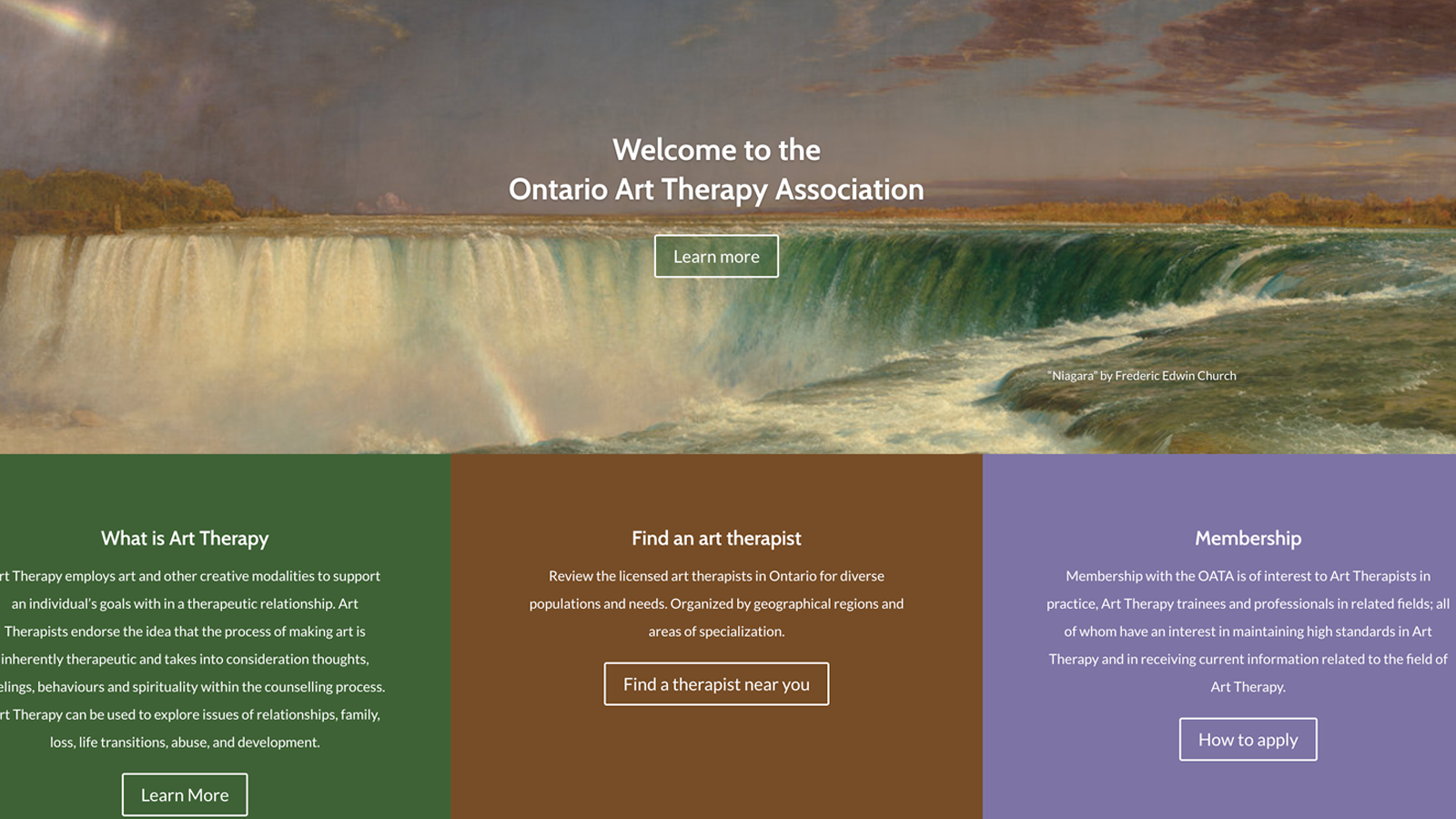
Rather than commission photography or rely on generic stock imagery, the site uses member-curated artwork as its primary visual element — including Frederic Edwin Church’s “Niagara” as the homepage hero. This was a deliberate choice that reflects the organization’s identity directly: art therapy is about the therapeutic relationship between people and art-making, and the site’s visual language reflects that. Content and artwork recovered from the previous site were integrated throughout.
Three audiences, one clear entry point each
The homepage surfaces three primary pathways immediately: What is Art Therapy, Find an Art Therapist, and Membership. Each serves a different visitor type without requiring them to navigate a complex menu structure to find what they came for. The full navigation then provides depth for those who need it — Ethics & Standards, Constitution, Supervision, Student resources, Publications, and more.
Two province-wide directories
The site includes two separate searchable directories — Find an Art Therapist for the general public, and Find an Approved Supervisor for practicing professionals seeking clinical supervision. Both are organized by geographic region and areas of specialization, giving users meaningful ways to filter results relevant to their specific situation.
What Was Built
- Full site redesign and rebuild — information architecture for three distinct audience types
- Province-wide art therapist directory with geographic and specialization filtering
- Approved supervisor directory for practicing professionals
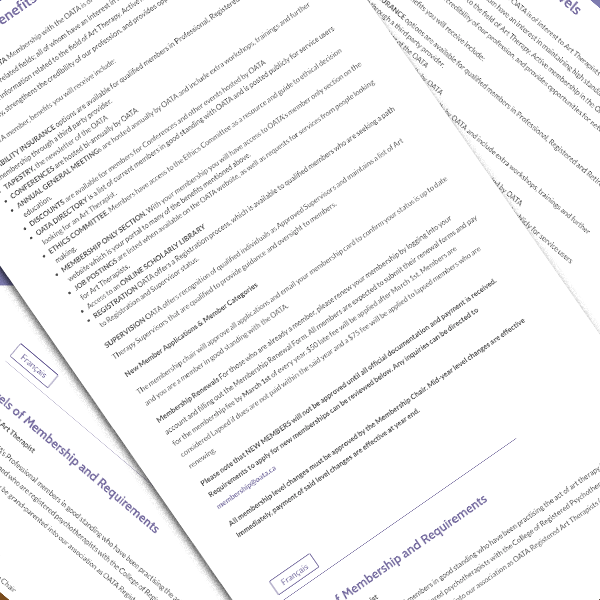
- Membership management and fees — application, multiple membership levels, and renewal
- Secure members portal with login-gated access to publications, resources, events, and required documents
- Student section covering training programs, volunteer opportunities, and FAQ
- News, events, and conference listings
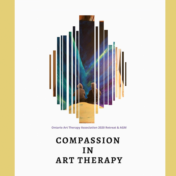
- Gallery featuring member artwork
- Donation functionality
- Live Instagram feed integration
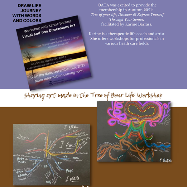
- Content and artwork recovered and integrated from the previous site
- WCAG 2.0 accessibility compliance
- Ongoing maintenance and content updates
Reflection
OATA is a good example of what association web work actually demands: not a single user journey, but several running in parallel, each with different information needs, different levels of familiarity with the organization, and different reasons for being on the site. Getting the architecture right — so a member renewing their registration and a member of the public looking for a therapist can both find what they need without friction — is the real deliverable. The visual design supports that, but it’s the structural decisions that make the site work.
Using recovered member artwork as the primary visual element rather than stock photography was the right call. It costs nothing, it’s authentic to the organization’s identity, and it tells visitors something true about what art therapy actually is before they’ve read a word.